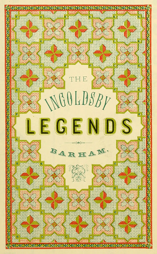
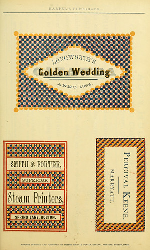
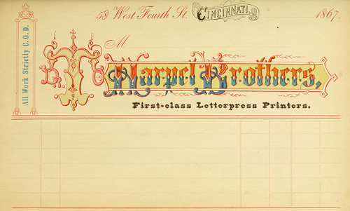
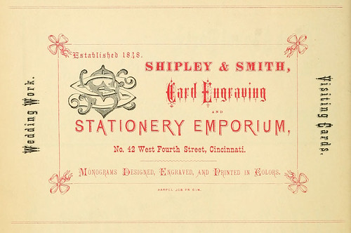
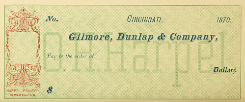
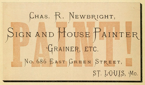
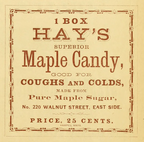
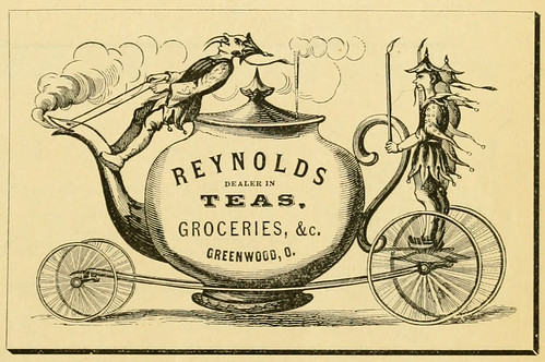
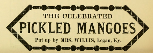
I keep flipping through Harpel's typograph and more and more I'm wishing for a time travel machine.... Wouldn't you agree that silly simple things like choosing a painter, visiting the stationer, buying hankies - even writing checks looked oh so glamorous?!!??






24 comments:
lovely indeed!
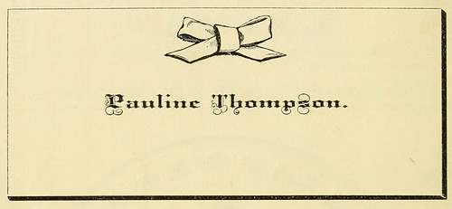
Beautiful! Makes me so sad for the business cards of today. Pauline Thompson's simple bow print absolutely slays me. Thank you for bringing these to my attention!
These images are great! I love that bow letterhead
wow! these are all in incredibly inspiring. thank you!!
These are so lovely, I just get the impression that there was so much more effort/ceremony going into these simple, everyday things back then!
These are gorgeous! I do love old typography but I really wish for a time machine when I see old fashion magazines. . . especially the ads! All of those gorgeous dresses for like $4.95. Sigh....
oh wow I really coulnd't agree more! these are wonderful inspiration! the pauline thompson business card is absolutely myfavourite by far!
thanks effffieeee!
wow, these are great. thanks for sharing.
oh wow... that's so so so kwl!
xxxc
http://clothestohealabrokenheart.blogspot.com/
these are mesmerizing!
i'm overwhelmed with all that glorious typography! i love that there are a good number of different fonts per page...
xo s
Wonderful. Now I'm going to spend the next hour looking over these. :)
I want to print these and use them as labels for things!
Oh, looking at these just makes me feel good! Cream stout for invalids! Mmm.. The colors are so fresh!
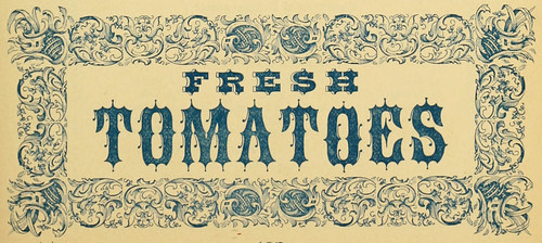
I love the heavy, pointed gothic font for fresh tomatoes- what a juxtaposition. Typography makes my heart swell and beat faster.
each and every one of these is breakin' my heart! i'm workin' on a new logo (and treats) for growin'up and these are definitely inspiring me.
can i come and visit you at work one day? sounds so dreamy.
wish i had these in my room.
xx
the crumpet girls
http://crumpetsandt.blogspot.com
So fancy! It's the little touches of care that go into everyday things that make the era, I think.
Would it be ok if I added your blog to my blogroll?
SUCH beautiful typography. Great post!
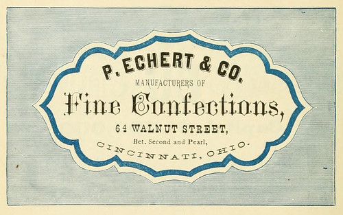
What loveliness! I particularly like the Fine Confectioners of 64 Walnut Street. I do like an evocative address, there's a Dark Lane near me which also fits the bill.
And hello, it's my first visit, I come to you via Linneas Vintage blog by way of Liebemarlene Vintage. So, nice to meet you, I'm off for an explore...
What gorgeous fonts they used!
The typography is so, so pretty!!
Charming each and every one!
Sooo perfect and gorgeous and all things lovely!!!!! I wish everything still looked like this today...I think life would be that much lovelier! Ooh, imagine signing checks that looked as nice as these? That would be the best!! I can't even pick a favorite! They're all so wonderful!
xx
Really sweet, I wish fonts and typefaces were that exciting these days..
Post a Comment